Building Responsive Sites
Techniques for tailoring content to device size for a project documentation site
Summary
Dharmafly required an approach to documenting its project websites. These needed to be built to cover a number of colour themes and to be built from text only project documentation at a single click.
The sites should look good to developers using the ways of browsing the web developers use - modern browsers and modern devices.
Approach
The requirements and intended audience for the websites meant that the site was built from a mobile first point of view. In practice, this means doing very little, as the web is responsive by default.
The key thing that is required is a device width
<meta name="viewport" content="width=device-width,initial-scale=0.75">
Using the viewport meta allows devices such as the iPhone to distinguish between a standard site, that the device will scale down to fit within the smaller width of the device, and a site that intends to have its content fit into the device’s width. This article covers Safari’s device scaling
If all sites were designed without fixed widths, this meta element would not be required and the device designers would not need to perform scaling on fixed width sites.
width=device-width specified in the meta viewport element 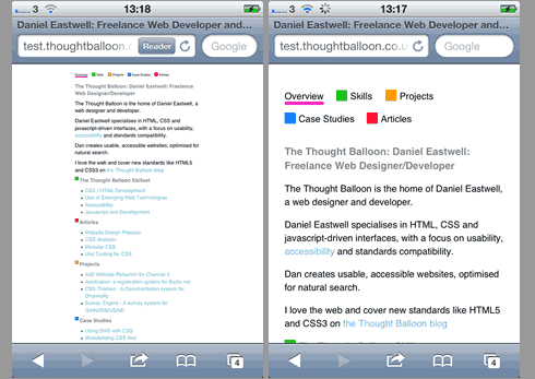
I adjusted the initial scale to be slightly lower than 1, due to the generous nature of the padding on the containing elements, this allowed for a broader measure on the copy.
initial-scale=0.75 specified in the meta viewport element
Floating navigations
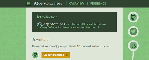
Within a smaller device, the header as designed for the desktop would take up the vast majority of the user’s screen.
There were also two possible navigations. One would show the pages in the site, ususally ‘overview’ and ‘reference’, and the other would show, for example a list of functions to be documented for the project. The length or width of this could be considerable.
The initial approach was to have the left hand navigation ‘disappear’ at smaller widths, to be replaced by an icon. Clicking the icon would slide reveal the navigation. This is a fairly standard pattern.
This was implemented successfully, and is still present within larger width devices (go to http://jquerypromises.com/ and reduce your screen width.)
The issue came with the permanently present navigation. As the page scrolls, navigation is set position:fixed as is the subnav. This is no issue for the main navigation, as it is centered using CSS. The subnav must tag along to the left hand edge of the main content on resize, so must be calculated using javascript.
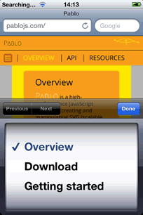
Due to the problematic support for position fixed within iOS, let alone with animated opacity, we decided upon a completely different pattern. In a narrow width environment, the subnav is mapped to a hidden select dropdown element, and shown on click of the nav icon
Finessing the style
You might be wondering why I’ve not mentioned media queries yet.
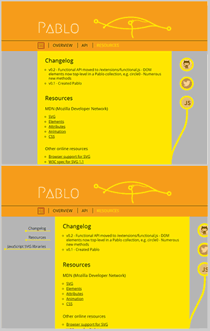
Given that the site has a liquid layout and a viewport meta element defined, setting different styles at breakpoints is for little more than finessing the style. For example - the twitter links are represented by icons covered by an SVG colour layer.
They’re just a list in the copy at smaller widths,
aside li,
.buttons .badge {
  float: left;
  margin-right: 1em;
  position:relative;
}
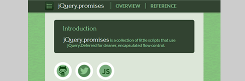
but at larger widths, they grow out of the main content on an SVG ‘stem’
@media (min-width:52em) {
  aside {
    position: absolute;
    top: 3em;
    right: -10em;
    margin: 0;
    z-index: 5;
  }
  aside li {
    float: none;
    margin-right: 0;

}
Other techniques
These are just a couple of patterns and a couple of techniques for working around them. There are many other design patterns for rearranging elements for device widths, and techniques for adapting the layout.
Additionally, there are adaptive techniques for changing the content such as changing the image src based on device width.
I don’t have one fixed approach to responsive web development, in this instance device width and an alternative design pattern were the required implementation.